ShopDreamUp AI ArtDreamUp
Deviation Actions
Daily Deviation
Daily Deviation
June 9, 2012
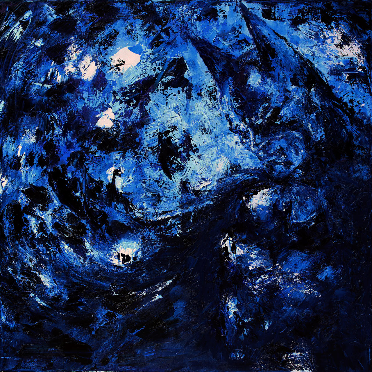
I am the Night by *Souzay
The suggester says: "A beautiful painting by a talented painter. It shows the struggle of Batman, the quiet deliberation in the contrast between the chaotic strokes in the sky and the more subdued, fizzling strokes that make up the bat himself. This piece captures the essence of the Batman and his constant struggle with the shadows of night."
The suggester says: "A beautiful painting by a talented painter. It shows the struggle of Batman, the quiet deliberation in the contrast between the chaotic strokes in the sky and the more subdued, fizzling strokes that make up the bat himself. This piece captures the essence of the Batman and his constant struggle with the shadows of night."
Featured by alexandrasalas
Suggested by 0hgravity


Suggested Deviants


Suggested Collections


You Might Like…


Featured in Groups


Description
Yay puns 
Finally finished this for

Was inspired by 0hGravity's
There was a lot I was going for in this painting but I don't like to explain my art @_@ I wanna know what you guys think!
ref: [link]
Oils.
I used a palette knife for this... never used one before O_o' sooo much easier to clean than brushes @_@
edit: A Daily Deviatation!?!? I just woke up to go to work and saw this.... There is no way I can have a bad day now! I feel so unworthy!
  THANK YOU SO MUCH!!!! I never ever thought I would receive a Daily Deviation!
Finally finished this for
Was inspired by 0hGravity's
There was a lot I was going for in this painting but I don't like to explain my art @_@ I wanna know what you guys think!
ref: [link]
![[link]](https://www.deviantart.com/users/outgoing?http://www.geek-art.net/wp-content/uploads/2010/10/Garang_batman_solitude.jpg)
Oils.
I used a palette knife for this... never used one before O_o' sooo much easier to clean than brushes @_@
edit:
A Daily Deviatation!?!? I just woke up to go to work and saw this.... There is no way I can have a bad day now! I feel so unworthy! THANK YOU SO MUCH!!!! I never ever thought I would receive a Daily Deviation! Image size
3170x3169px 10.89 MB
Make
Canon
Model
Canon EOS REBEL T3i
Shutter Speed
1/197 second
Aperture
F/4.5
Focal Length
60 mm
ISO Speed
100
Date Taken
Jun 4, 2012, 1:39:02 PM
Sensor Size
14mm
© 2012 - 2024 Souzay
Comments303
Join the community to add your comment. Already a deviant? Log In
Amazing work. In a few words.
What're Batmans' best colours? Sure, dark colours.
So, as you can see, first and main thing's colour. Great variety of white, black and all the shades of blue. The mix of the charge colours make this looks brilliantly. All of them are going perfect.
Technique of strokes is very nice chose. Strokes're giving a picture mystery of the Batmans' nature - he's the night, and we can see that on this picture. It seems like Batman's vanishing in the darkness, blending with deep nighty heaven.
This picture reminds me Batman from 'Arkham Asylum: Seriuos House on the Serious Earth' written by Grant Morrison and illustrated by Dave McKean. There was dark oppressive atmosphere, and you know - your pic has it too. Not so dark oppressive that was in graphic novel, but dark that needed to show the depth of this art.
About originality. Many of artists like to draw Batman in this style. I mean impressionism. That art movement's surprising always, and this style's best for Batsy. Why? 'Cause this style focuses on superficiality, staff turnover moments, mood, light and angle of view, and that things're need to drew a good Batman pic.
Your work's only one in its' nature. Everything's great.
This is splendid art without any bad things and mistakes.